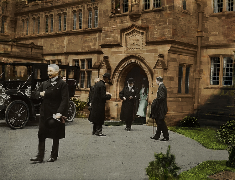
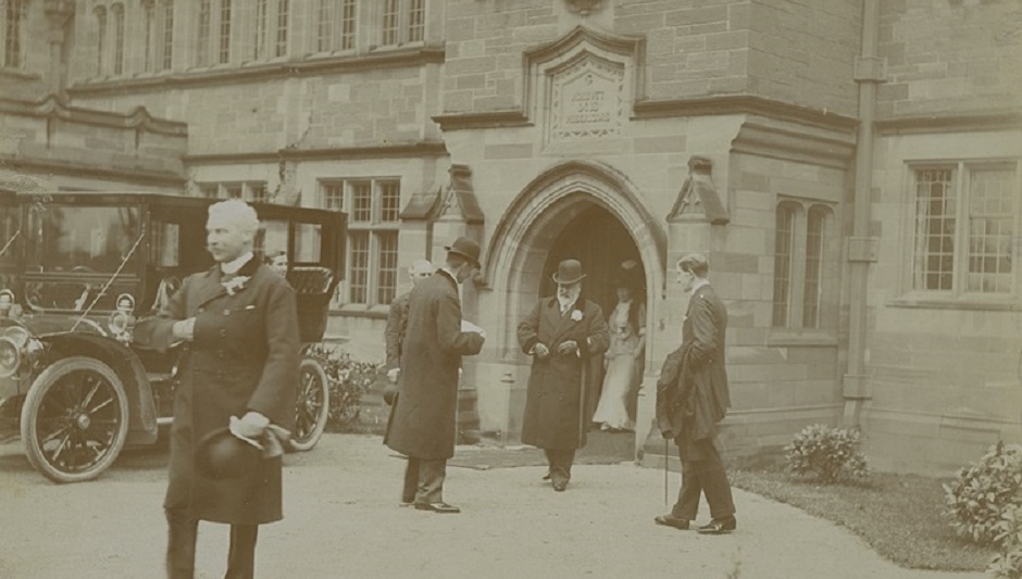
Early sepia-drenched photographs of Gladstone’s Library I have seen are curious. They are strange portals into a familiar but unfamiliar world. They can also be a bit like dusty moths, lifeless and flattened in the pages of history. I wanted to (amateurly) try and put a bit of colour in one.
There are ethics involved with doing this sort of thing. It’s often considered disrespectful to the people in the images. And I did often feel like a child drawing on a photograph with a crayon. Some people think that colourisation detracts from the original work. As world-renowned colourist Jordan Lloyd explains, ‘these things are not supposed to be substitutes for the original documents. It sits alongside the original.’ With that in mind, I decided to give it a go.
I chose an image depicting King Edward VII’s visit to the Library on 13th May 1908. Many people consider this to be the key point at which the Library was ‘opened up’ to the public. King Edward is pictured leaving the Library, with Queen Alexandra behind him. The Queen herself described Gladstone as ‘that great and good Man whose name will go down in letters of gold to posterity of one of the most beautiful upright and disinterested characters that has ever adorned the pages of history.’ Their visit was reported in numerous newspapers, and this helped raise awareness of the Library’s existence.
I started the colourisation process by patching some slight tears in the photograph with Photoshop’s ‘healing tool’. The image was fairly grainy, so I cleaned it up a bit. I altered the tonality to bring key areas into focus. I then partially desaturated the image which gave me a base to start colourising it. I overlayed a recent colour photograph that was taken from roughly the same position. This helped me get an idea of the colour palette to use for the building. There were some difficulties colourising the rest of the image: Queen Alexandra had a diverse wardrobe, and though I researched written accounts of her visit, no one commented what she was wearing on that day. I based the colour of her dress on a painting done by Edward Hughes in 1896. Some areas of the image looked odd coloured in, and the man in the foreground had a particularly clumpy barnet. But the process was thoroughly enjoyable.
The result is a little sickly-sweet. The colour is rich, and obviously edited. At times, the Library looked skin coloured and the people looked brick coloured. I tried my hand at colourising Gladstone; he looked like Mr. Blobby cast in a tree felling pantomime. I am oblivious to the techniques of professional colourists, and I came to really appreciate their skills and patience. I also discovered the level of expertise to needed to work out the colour of clothes and objects throughout history.
The one thing I didn’t need to consult the archives or research for was the colour of the Library itself. It has been 111 years since the original photo was taken. The edifice’s subtle sandstone tones have stoically stood the same over the course of those 111 years and will do so for the next 111 years.

By Alistair Hopson, Graduate Work Experience
What do you think of our attempt? Get in touch, and if you have a historic photograph of Gladstone’s Library that you think is worthy of colourisation, please let us know!
